SiteWorks Authoring Tips (advanced)
The author’s suggested SiteWorks authoring best practice and tips. Most of these are advanced WordPress topics so if you are studying the Workbook or have recently gone live consider returning to it at a later date.
Contacts
SiteWorks provides a Contact form as the means for a visitor to communicate with the u3a/Network/Region. It sends an email without the email address being revealed and thus respects the privacy of the recipient. The Contact form works rather like a page link in that the user clicks on a link such as ‘Contact us with this form General Enquiries‘. The difference is the Contact form page is invoked with information that tells the form the address to send the email to and the nature of the contact i.e. General Enquiries. This means the same form can be used to contact say the Membership Secretary or the Group Coordinator with a title such as ‘Membership Enquiry’ or ‘Groups Enquiries’.
The link to the Contact form uses a construction called a shortcode that can lookup the contact in the list of u3a Contacts by using the name of the contact page.
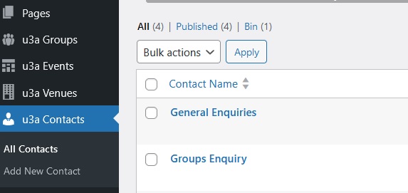
This screenshot shows two contact name entries ‘General Enquiries’ and ‘Groups Enquiry’

The shortcode for a general enquiry would look like [u3a_contact name=“General Enquiry”] and this can by typed into any Paragraph block.
A shortcode doesn’t have to reference the u3a Contacts list. It can include the email address to contact in the shortcode. For example:
[u3a_contact name=“our May 2024 speaker on local history” email=“cherryp@ggmail.com”]
In general it is best to reference the u3a Contacts list with a generic role name such as ‘Membership Secretary’ rather than putting an email address in the shortcode. When a new member takes on a role it is only necessary to edit u3a Contacts rather than hunt through all the shortcodes on the site’s pages.
For someone who is external to the u3a, such as a guest speaker in the example above, then citing the email address in the shortcode will be appropriate as they are not a u3a Contact.
WordPress provides a shortcode block to place a shortcode in, but using this rather clutters up the page editing experience. A u3a_contact shortcode can be placed directly in a paragraph block:
You can contact us with this form [u3a_contact name =”General Enquiries”]
Migration of Home and Welcome
Site Builder has both a ‘Home’ and ‘Welcome’ pages and these come across during migration as separate SIteWorks pages. The ‘Home’ page is limited to a picture and caption and serves no real purpose. On SiteWorks the Welcome page usually become a single WordPress ‘homepage’ (Settings > Reading) and often incorporates the picture on the Site Builder ‘Home’ page.
Smartphone/Tablet friendly:
Tablets and especially smartphones have narrow screens. Perhaps the main reason for introducing blocks to WordPress was to make it easier for WordPress to render a page on a narrow screen. It does this by stacking blocks above and below each other rather than side-by-side.
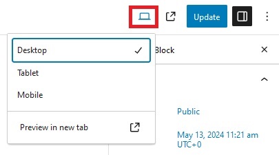
Note that resizing your desktop/laptop browser does not simulate how your page will look on these devices, it just compresses it. Use the ‘View’ icon on the top right when editing a page to see what it will look like on a Mobile (smartphone).

To display an image next to text use the ‘Media and text’ block as above rather than the ‘Columns’ block. It likely to stack better because the text will always be next to the image. With columns the entirety of each column will be stacked in one column..
Ways of Working:
- Use an additional browser tab when editing to make it easier when bringing material together. For example, have one tab with the ‘Media’ open or a page where you want to copy/paste blocks from.
- When editing, the preview is not always available. For example when editing the template menu. Use a different browser (or a private window on the same browser) to view and check the page after saving (Updating) it.
- To enlarge the space between blocks an easy way is to use a /Spacer block.
- To remove a gap (margin) between blocks then on the right-hand panel for the page under tab ‘Block’ locate ‘Dimensions’ under the half-moon styles tab. Click the three dots and select ‘Margin’ from the list that pops up so it’s ticked. Play around with the slider or click the double arrows on the right and type 0 (zero) in the box. This is an alternative approach to the spacer block.
There is a fuller description here https://wordpress.com/support/block-dimensions-settings/ - This method can also adjust the spacing between list elements – select Padding from the Dimensions menu and play with the slider.
- Copying/Pasting from a Word document works surprisingly well although the images need to be uploaded separately.
- If you want a continuous background colour for more than one block then Group them together and apply the background colour to the Group.
These two paragraphs are grouped together
Select a block and holding down the shift key select the next block. The group icon will appear in the block toolbar.
Revision History
| Version | Date | Author | Change summary |
| 1 | 2024-04-30 | Graham Tigg | First version |
| 2 | 2024-05-16 | Graham Tigg | Improved headings, more explanations |
