Introduction #
While the Navigation bar at the top of a webpage provides access to the site’s pages, it’s not the quickest for a new visitor to find specific information, e.g. a membership form or the latest newsletter. A Button gives direct access to specific information, e.g. a document or a specific location on a webpage. A Button can either appear individually or in a group.

It should be noted that:
- A button can only contain a URL to another location either on the current website or elsewhere on the internet.
- A button cannot contain a shortcode. If the content creator wishes to provide a “button” to initiate contact using the contact form shortcode, a pseudo button needs to be constructed as discussed here.
Adding a button #
Select Buttons from the block inserter to add a Button to the page. Selecting the Buttons block (using the Breadcrumb at the bottom of the screen helps) gives the following:

The Buttons toolbar gives the following options from left to right:
- Transform to another block.
- Drag the block
- Move the block up and down the page.
- Change items justification
- Change vertical alignment
- Further options include adding notes, hiding and deleting the block.
The block inserter to the right adds additional buttons.
If an individual button is selected, the toolbar changes to:
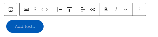
The button toolbar gives the following options from left to right:
- Select the parent Buttons block.
- Button styles, either fill or outline, as shown below.
- Drag block handle.
- Move a button left and right within the container; this is only available if multiple buttons are present.
- Change a button’s justification on the page (left, centre, right, or equal space between).
- Change vertical alignment (top, middle, bottom, or stretch to fill). This is useful if a button has multiple lines of text.
- Change text alignment (left, centre, right) within the button.
- Add a link to the button.
- Bold, Italics, and additional text formatting options
- Further options include adding notes and deleting the block.

Configuring a Button #
After adding button(s) and text, the required link and formatting can be added.
Linking #
The text and associated link can be added by selecting the button and:
- Add the required text.
- Select the Link icon in the toolbar.
- Search for an existing page on your site or type/paste a URL.
- Select Enter to confirm the link
Formatting #
The right-hand sidebar contains a large number of options for formatting a button, as follows:
- Typographical colour, size and style.
- The buttons’ background colour, solid and gradient fills are available.
- The padding and margin dimensions.
- Button width; selecting this option fixes the button width to 25%, 50%, 75%, or 100% of the parent block’s width.
- Border, size and colour.
- The Elements option modifies the link colours; the default value is recommended.
- The Advanced option lets you add an HTML anchor and additional CSS.
In addition, a button can be configured for several pseudo states by selecting the three vertical dots; definitions of the states are:
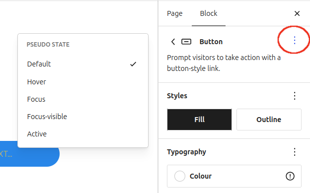
- Default: The button’s appearance when no user interaction is taking place.
- Hover: Appearance when a visitor moves their mouse pointer directly over the button.
- Focus: Triggered when the button receives focus. e.g. when an assistive screen reader targets the element.
- Focus-visible: A smart accessibility state triggered only when the element receives keyboard focus.
- Active: Triggered only at the exact moment of physical interaction.
For most u3a content creators, the three states of interest are: Default, Hover and Active. The button can be configured by selecting the state, and then formatting using the options in the sidebar. In the example below, each state has been configured differently:
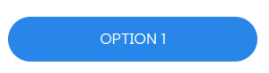
Default: Blue background, white text
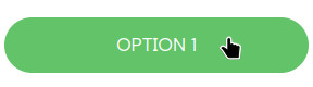
Hover: Green background, white text
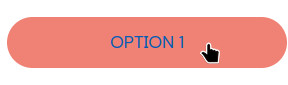
Active: Red background, blue text
Adding additional Buttons #
Adding additional buttons requires the selection of the parent block at the far left of the Toolbar, and then selecting the block inserter when Buttons is selected

The Buttons Toolbar allows the content provider to position the buttons as required, and modify the appearance of all buttons (text colour, font colour, etc).
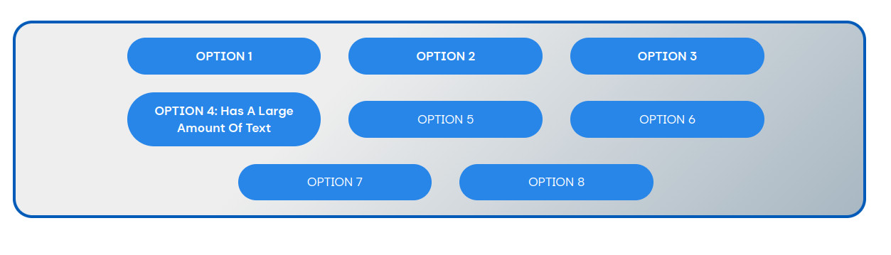
Once the first row of buttons is entered, WordPress will move to the next row. If you have multiple buttons, care should be taken with the layout, as the button width depends on the text length, unless the content creator selects Allow to wrap and defines the button as a percentage of the page width using the option in the Button’s setting sidebar.
In the example below, the buttons’ width is set to 25%, and word wrap is selected.

Additional Formatting #
Within the Buttons sidebar, a wide number of options are available:
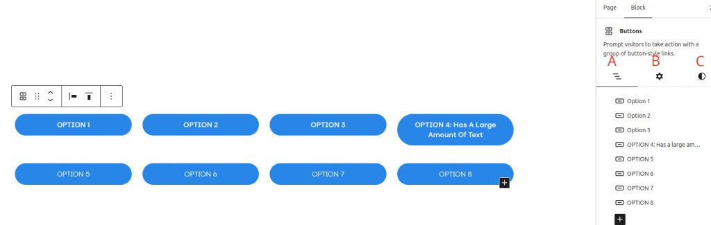
- List View: Overview of all the Buttons in the group. The content creator can select individual buttons, drag a button to reposition and delete a specific button.
- Settings: Ability to enter an HTML anchor for all buttons and additional CSS.
- Style: The following options are available:
- Setting the global typographical style.
- Setting the background colour; a gradient option is available.
- Setting the layout justification and orientation.
- Padding and margin dimensions.
- Setting the horizontal and vertical block spacing.
- Border colour, size and radius.
The formatting of the example below was:
- Individual Button
- Blue background, white text. Button width set to 25%.
- Button Group
- Padding set to X-small, block spacing to 2X-small, justification to centre.
- Grey gradient fill, 4px blue border with 24px corner radius.