Introduction #
A web page in SiteWorks consists of three elements: a header, a footer and the main text or contents area.
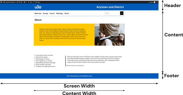
The style and the contents of the header and footer are determined by the u3a SiteWorks theme to ensure that all u3as have a consistent look and feel. The theme determines:
- The web page header and footer style and content.
- The range of colours available for text and backgrounds. The SiteWorks palette is restricted to the u3a brand colours
- The font is a web-compatible equivalent of the u3a brand-approved DS Sans font.
When a web page or post is created (regardless of whether the content creator is logged in as an administrator, editor, or author), the content can only be entered into the content area via the Block Editor. This user guide covers the general principles of the Block Editor’s operations; specific blocks are discussed in other user guides. Details regarding the editing of Headers and Footers are provided here.
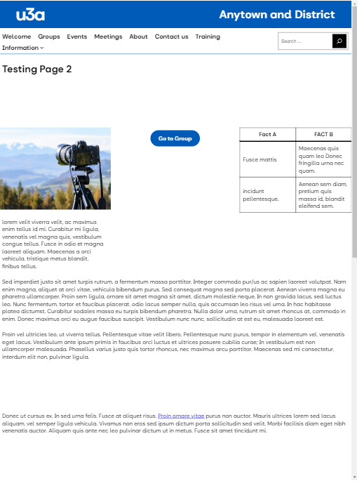
One point to note is that the u3a theme restricts the content’s width to 840 pixels on a standard computer monitor, hence the white space to either side of the content in the above screenshot.
The block editor puts the publishing control and formatting into the hands of the content creator without worrying about the underlying technologies. The concept is simple: text and media elements are contained within blocks stacked to form the web page. The size of a block is determined by:
- The contents are entered into a block. For example, an image block will be resized according to the image’s size.
- If a block (e.g. paragraph) is placed within a block (e.g. columns), its size will be constrained by the block higher in the hierarchy. In this case, the paragraph width will not exceed a constraint applied by the individual column width.
Controls allow the content creator to manipulate or modify the blocks to optimise the web page’s appearance. This allows individual u3a’s to have different design concepts, within the overall theme provided by SiteWorks.
Block Editor Administrative Toolbar #
When a page or post is placed in edit mode, the block editor administrative toolbar, shown below, appears, giving the content creator a wide range of options

On the left of the administrative toolbar, the content creator can select:
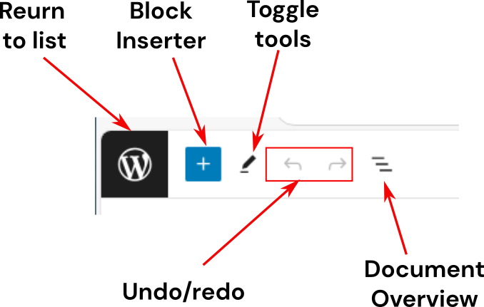
- The WordPress (or user-set) icon returns the view to the main page for the document type. If a page is being edited, it takes the user to the full Page List.
- The blue + icon toggles the block inserter.
- Tools as required; this only appears if the top toolbar option (see below) is deselected.
- The conventional undo and redo icons.
- Toggles the Document Overview in the left-hand sidebar.
At the centre, the page or post title is displayed, together with Ctrl+K to allow a search for commands and settings to be undertaken.
On the right of the administrative toolbar, the content creator can select:
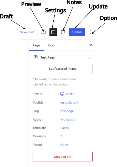
- Draft: select to save the edit as a draft. A view option is provided on saving.
- A preview of the page in edit mode, as it would appear on a monitor, tablet or smartphone.
- Select/deselect the right-hand sidebar that displays the Settings and Style panels.
- See the Notes associated with the blocks. If no notes are available, this icon is not displayed..
- Update the page. This will show Save or Publish if the page has not been previously published.
- Select the editor Options for the following:
- Set the view
- It is recommended that you select Top Toolbar to lock the block and document tools to the top left of the screen.
- Distraction-free – removes all unwanted material.
- Spotlight Mode greys out blocks not being edited
- Full-Screen Mode
- Editor – should always be set to Visual Editor (unless you want to edit in HTML!)
- Tools – including access to patterns and help documents.
- Preferences opens a new window that allows you to change the default settings. It is strongly recommended that you do not disable pre-publication checks, theme style, or display block breadcrumbs.
- Set the view
Using the Block Inserter #
Content Structure #
A page or post is constructed by “stacking” blocks, as shown below:
In this example, the following blocks are used:
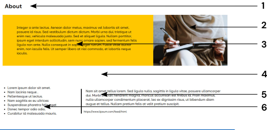
- The Title (1) is mandatory; WordPress uses this information to populate the site menu.
- A Media and Text block allows text in a paragraph block and an image to be placed alongside each other. An image (2) has been added to the right of the text. The text part (3) of the overall block contains a paragraph block and has been formatted with a u3a yellow background.
- A white Spacer block allows the content creator to customise the space between individual blocks, making the page or post easier to read, has been added (4).
- A quote block (5) and a list block (6) have been added within a two-column columns block, with a 1:2 ratio between the column widths.
The Block Inserter #
By default, when you start a new page, you are given a standard paragraph block as a starting point; other blocks can be added by selecting the + icon, the Block Inserter. The icon will appear at:
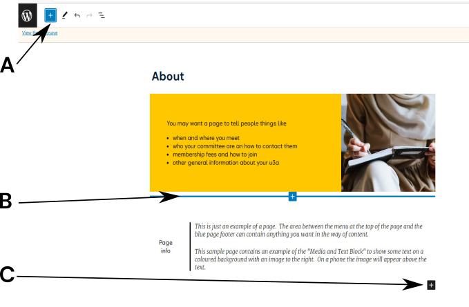
- The blue icon at the top of the screen, A.
- When the content provider hovers the mouse between any two blocks, a blue line with a + icon appears. The new block will be entered at this location, B. If the content creator is using a tablet or mobile device, the block inserter may not appear between blocks; this requires a slight modification to the editing process as discussed here.
- At the bottom of the current web page, C.
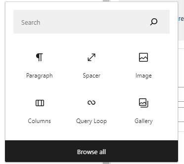
To select the list of available blocks, move the cursor over the +. In the case of A and B, the background will change to black. Once selected, a subset of the available blocks is shown, then:
- Select the required block from the visible options.
- Enter the full or part name of the required block, then click the search icon.
- Select, Browse all, to show all available blocks.

When scrolling through the complete list after using the Search option, the items at the bottom will install a plugin: these are listed below the heading Available to install. As noted, plugins should not be installed until testing has been undertaken.
On selecting Browse all, all the available blocks are made available, under four separate types, identified by the text and an icon, from left to right:
- Blocks: as discussed in this user guide.
- Patterns: predefined sets of blocks provided by WordPress, as discussed here.
- Media: provides a range of blocks to contain media, mainly images, as discussed here. In addition, this gives access to the media library and royalty-free image resources (Openverse).
- Search: across all available blocks, including their explanatory text.
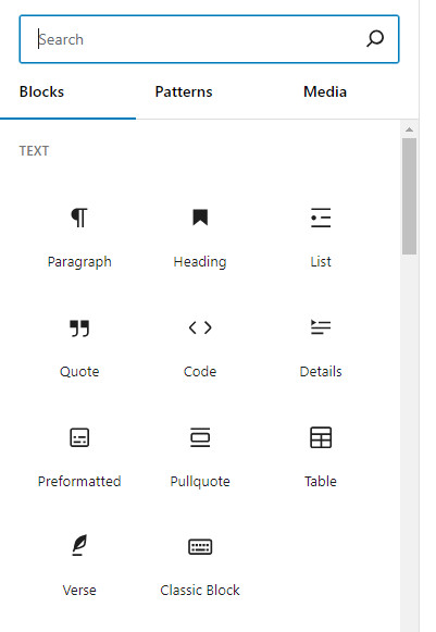
The blocks available are extensive and are divided into categories:
- Most used
- Text, including paragraphs, headings, and quotes.
- Media, including images, the gallery, etc.
- Design, including buttons and columns
- Widgets, including u3a specific functions (group and event details), shortcodes, etc.
- Theme, for configuring query loops, etc.
- Embeds, to embed a link to an external provider.
The use and configuration of individual blocks are fully discussed in the relevant user guide.
One key feature of WordPress is the ability to insert one or more text or image blocks into an existing block to form a block hierarchy. For example:
- A text block (paragraph, list, quote, etc) or image block in a column.
- A paragraph, quote or list block into the text area of a Media and Text or a Cover block.
Block Inserter Icon on tablets #
Several content creators have reported that the block inserter icon is not selectable between blocks, on a tablet or mobile device, hence:
- Select the block selector in the block inserter administrative toolbar or at the bottom of the page.
- Create the content.
- Reposition the block as required by dragging or using the up/down position icons.
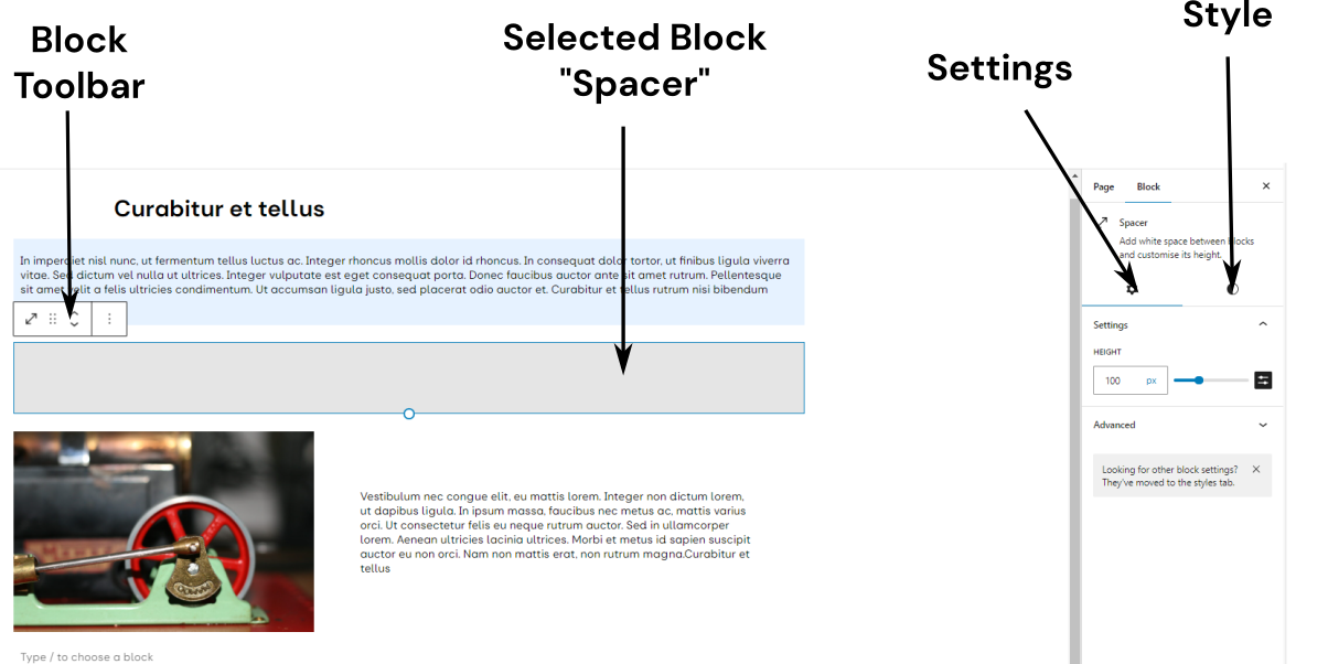
Configuring a Block #
When a block is selected, it can be configured. In the example below, the Spacer can be configured as follows:
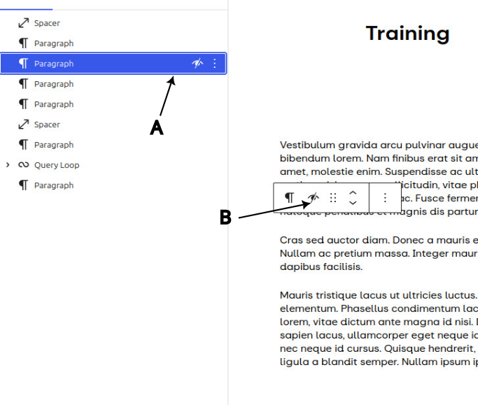
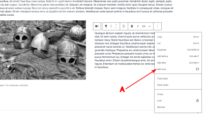
- The Block toolbar. Available options are: transforming to another block type, dragging the spacer up and down the web page, or moving its position above or below the adjacent blocks. Selecting the three vertical dots to the right gives other options, including deleting, copying or duplicating the block.
- For the right-hand sidebar:
- Settings – provided options for the block configuration. In the case of the Spacer, only its height can be adjusted. In other blocks, a large number of options and attributes are available.
- Style – provides options on how the block is displayed. right-hand sidebar, two options are available:
Setting and Style options available for the main blocks are summarised in the table below:
| Block | Text & Background Colour | Text Size | Margin and padding | Corner Rounding | Border | Drop Shadow |
|---|---|---|---|---|---|---|
| Title1 | – | – | – | – | – | – |
| Heading2 | Yes | Yes | Yes | No | No | No |
| Paragraph2 | Yes | Yes | Yes | No | No | No |
| Image | N/A | N/A | No | Yes | Yes | Yes |
| Media and Text | Yes | Yes | Yes | No | No | No |
| Columns3 | Yes | Yes | Yes | Yes | Yes | Yes |
| Group3 | Yes | Yes | Yes | Yes | Yes | No |
2 The heading and paragraph blocks do not have separate Settings and Style options
3 The full set of options refers to the full block, not the embedded blocks.
Margins and Padding #
With WordPress, two variables, Margins and Padding, can be set to help determine the overall presentation, as shown below:
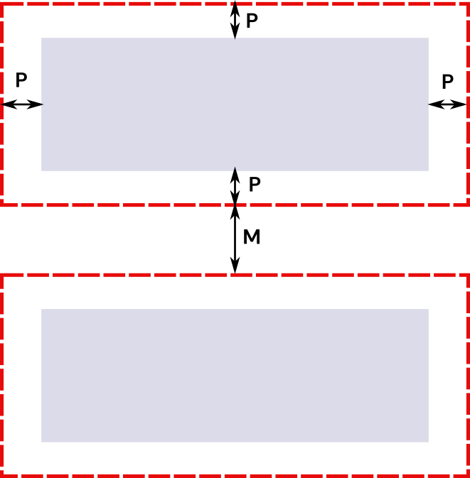
The diagram shows two blocks containing contents in the shaded area and their boundaries as the dotted line. The spacing can be controlled by:
- Margin: the distance between the two blocks’ boundaries, dimension M. Note this can be set to a negative value as discussed here.
- Padding: This determines the amount of white space (or coloured space, depending on the block’s settings) that surrounds the content, but within the boundary of the block, dimension P.
The four margin and padding values (top, bottom, left, right) can be set as a group or separately. To set the margin or padding, select Dimensions and then Padding or Margins as shown below:
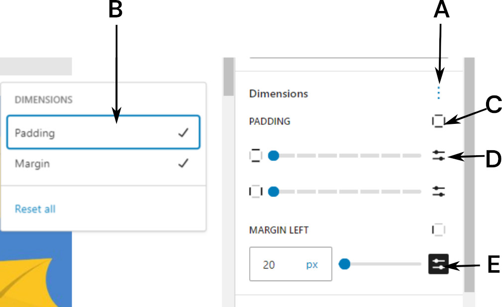
A: The three vertical dots allow the selection of either margins or padding.
B: Select either Padding, Margin or Both
C: Allows the selection of horizontal, vertical, top, bottom, left and right.
D: The Blue dot can be moved to select a predefined size. If the slider bar icon is selected, the mode can be changed.
E: The exact size of the margin and padding can be entered in several units (px, %, em, rem, vh and vm). The value for Margin can accept a negative value.
Negative Margins #
A negative margin extends the content creator’s options when designing pages. Consider the following layout, consisting of a two-column structure, with an image on the right-hand side and text on the left.
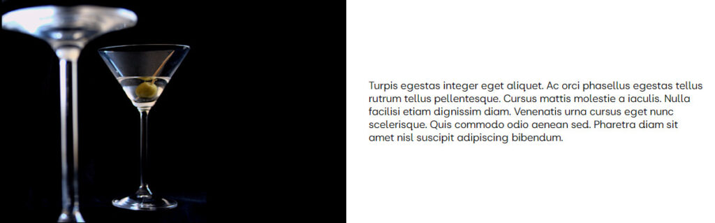
The image can be modified by setting the text in white and the column background in black. With the paragraph margin set to -12 rem, a more dynamic image results.

Block Visability #
This feature allows content providers to:
- Prepare content or experiment with design changes without displaying them to visitors. This could be used when testing sections, staging content, or temporarily removing parts of a page without deleting them.
- The ability to hide the content on a specific type of device, i.e. desktop, tablet or mobile device.
To hide a block, select the block, then select Hide from the block’s option list. This displays the Hide block option box (noting that the rest of the screen is greyed out):
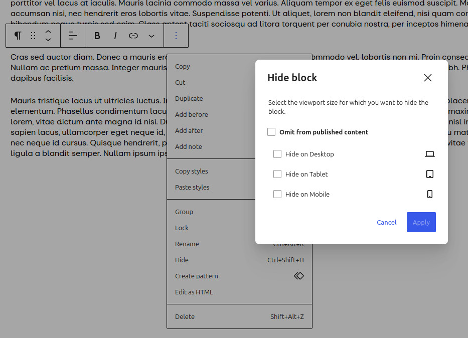
The content creator can then select one or more of the four available options, and then click Apply.
Once any of the options is selected, the paragraph is hidden from view, but remains in the list view. A hidden block will have the hidden icon appended (A). To restore, select the block in the list view, which will show the block’s option bar; then, select either the hidden icon (B) or Show in block’s option list. The Hide Block option box will appear, allowing the content creator to cancel the required hidden option.
Adding a note to a block #
As this feature sends an email to the page or post author, the administrator must ensure that the author is set to a local user, not SwDevAdmin. The page or post author will be set to SwDevAdmin in any site that was migrated from Site Builder or in a Starter site. The process to change the author is here.
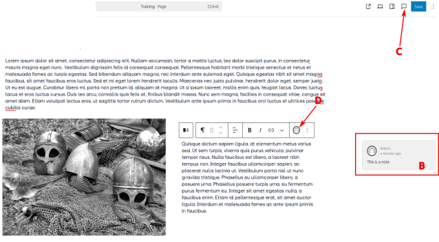
To aid collaboration, content providers can write notes and reply directly at the individual block level, providing tracking changes and feedback during the editing process. Notes can be resolved, edited, and deleted; email notifications are sent to the post’s author when a new one is left. To add a note, from the block’s toolbar, select Add Note (A). This will grey out all the other blocks except the one the note is attached to, and a panel will appear on the right-hand side of the screen where the note can be added. When completed, confirm by selecting Add Note in the note box.
Once a note has been added, it can be edited or deleted. If a note has been added, an icon will appear on the block editor’s administrative toolbar (C) and the block toolbar (D), identifying the note’s creator. On selecting either they notes(s) will appear (B).
The following viewing rights apply to notes:
- Administrators and Editors can view all notes on all posts.
- Authors and Contributors can view all notes for posts that they have authored.
- Subscribers cannot view any notes.
Document Overview #
If you select the document overview icon (or shift+alt+o) to the left of the administrative toolbar, the content creator can view the overview in a list or outline format.
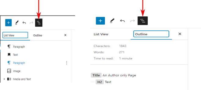
- The List view shows all the blocks on the page and their relative locations. By selecting a block, an item can be edited or moved. In the case of a list or table, you can navigate directly to specific items or rows.
- The Outline shows the heading used to allow correct positioning within the page structure. When an internal link is added, this is shown to the right of the block. The outline view requires the presence of an additional heading or link.
Breadcrumbs #
This section refers to the Breadcrumb feature in the WordPress editor, and not the Breadcrumb Block, which can be added to pages. This feature is discussed here.
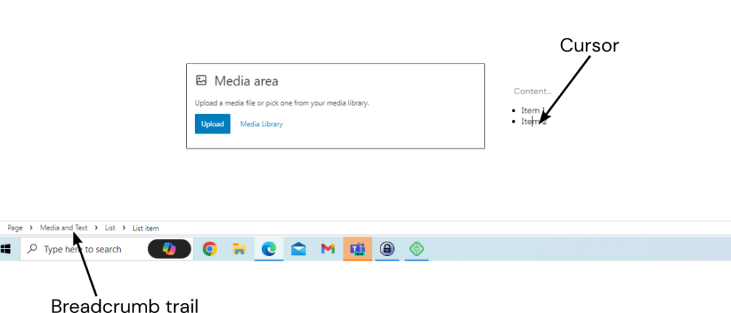
As web pages and posts become more complex, it is easy to lose sight of which block is being edited. To help with the editing process, apart from the document overview, WordPress has a Breadcrumb feature, which is found at the lower left of the editing screen.
The breadcrumb trail will expand as the page or post content creator adds blocks within blocks. For example, editing a list row within a Media and Text block, the trail will appear as:
Page > Media and Text > List > List Item
As shown below trail shows that the page creator is editing a row within a list. If you want to select the complete list, select List.
Preview Before Publication #
As Web Managers will be aware, a website can be viewed on devices including tablets and mobile phones, in addition to desktop monitors typically used for editing. WordPress, together with browser technology, can reconfigure web pages to match screen size.
Two approaches are available to preview content before publication: either using the WordPress function or those offered by the web browser.
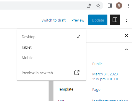
WordPress #
To preview a document, select Preview from the administrative toolbar. This gives three options: Desktop, Tablet and Mobile. Select the view required, and then select, Preview in new tab, to display the page or post in a separate tab.
Chrome or Edge #
- Use the F12 key to access the Developer Tools. In Chrome, a considerable amount of information about the website may be shown, but this can be ignored.
- Press Ctrl + Shift + M on the keyboard or select the Toggle Device Emulation icon on the DevTools top ribbon to open the device toolbar:
- Click the browser’s refresh button to reload the page and make sure you’re seeing the mobile view of the page
- Click on the device toolbar and choose the mobile device to be emulated. The view can be rotated as required.
Firefox #
- Press Ctrl + Shift + M on your keyboard to open the device toolbar
- Click the browser’s refresh button to reload the page and make sure you’re seeing the mobile view of the page
- Click on the device toolbar and choose the mobile device that you want to emulate
Safari #
- Make sure the ‘Develop’ option is visible in the menu (if ‘Develop’ isn’t visible, go to Safari ⇒ Preferences ⇒ Advanced; tick the ‘Show Develop menu in menu bar’ box)
- Press Ctrl (^) + Cmd (⌘) + R to open Responsive Design Mode
- Click the browser’s refresh button to reload the page and make sure you’re seeing the mobile view of the page
- Choose the mobile device that you want to emulate
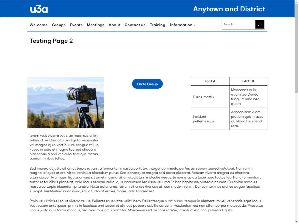
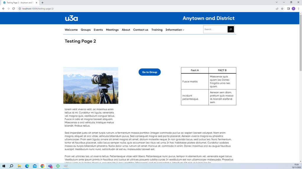
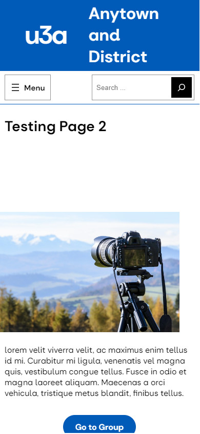
A selection of views of a single page is shown below, for a tablet, computer monitor and tablet. It should be noted that these views are simulations and should be treated as indicative – it is always advisable to check the actual display on the actual or a similar device.