Introduction #
As discussed in the Publishing a u3a Website user guide, before any text is entered, the content creator must ensure that a plan and/or draft of the material to be added to the site is available.
In this user guide, it is assumed that the WordPress item (e.g. pages, group pages, event pages, contacts, etc.) has been created, and the content creator wishes to add additional text-based elements using the block editor. The creation of actual pages and posts is considered in the relevant user guides.
Text may be added to or modified with a page, using the following blocks:
- Headings
- Paragraph
- Quotation or Verse
- Lists
- Tables
- Detail Block, typically used for FAQ
- Social Media Icon
- Symbols
Headings #
The use of Headings is a significant feature of a website, as it allows visitors ( and search engines) to understand the structure of the website. The WordPress block editor provides a range of headings from H2 to H6; H1 is reserved for the page’s or post’s main header. The appearance and level of the heading can be adjusted from the Heading Block Toolbar or the block sidebar.
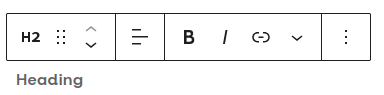
The toolbar gives the following options from left to right
- Change block from heading to paragraph, etc.
- Drag the block handle to change the block position
- Move the block up or down one block
- Select the heading level
- Align the header text to the left, centre, or right, noting that consistency across the u3a site is required.
- Selected text to bold
- Selected text to italics.
- Insert hyperlink
- Additional text options
- Additional options include removing the heading.
The sidebar gives a similar range of options, including colour, padding and the addition of a border.
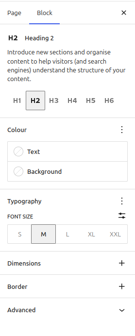
The options available in the sidebar include:
- Selecting the heading level.
- Text and background colour.
- Typographical options
- Adding padding and/or margins
- Adding a border
- Adding an advanced option, including an anchor, additional CSS and applying the new configuration across all headings of that level on the site.
A change to a heading style (in particular colours) may have an impact on other parts of the site, including templates and headers – hence any change MUST be fully tested before implementation.
The theme fixes the relationship between the header font size and header level, though it can be adjusted using the Typography settings. It is recommended that all heading sizes across a site remain consistent for usability. When creating content, ensure that the nesting of headers is correct.
- Heading 2
- Heading 3
- Heading 2
- Heading 2
Incorrect use of headings for sections and subsections, a single subheading should not appear between two main headings.
- Heading 2
- Heading 3
- Heading 3
- Heading 2
Correct use of headings for sections and subsections
Paragraph #
Adding a Paragraph #
From the Block Inserter, select Paragraph and enter the required text directly.
When text within a paragraph block is selected, a range of text and block formatting options can be applied using the Block Toolbar
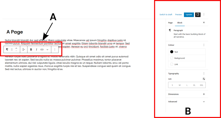
With the Block Toolbar (A) you can:
- Change the block to a related block (e.g. Paragraph to Heading).
- A handle to change the block position.
- Move the block up or down by one block relative to its current position.
- Align the text to the left, centre, or right.
- Make the highlighted text bold.
- Make the highlighted text italic.
- Insert a hyperlink.
- From a pull-down menu, it is possible to format the selected text, for example, changing the text and/or background colour, and changing the text to be superscript and subscript. In addition, a footnote can be added.
- Edit options include copy, duplicate and delete.
The right-hand sidebar, B, allows further options for the complete block, including text and background colours, and changing the font size to a multiple of the normal size. An important point to note is that the default background colour for a paragraph block is transparent. Unless the colour is explicitly selected, the block will show the underlying colour or image; this is of particular importance if the block is used in conjunction with a Cover or Column block.
It is recommended that content creators do not use a paragraph with bold text in place of a heading, as this will:
- Not be picked up as a heading by search engines.
- Be incorrectly shown in the document overview.
Under the advanced settings, you can add an anchor name for the paragraph. This allows the paragraph to be used as an endpoint for a link, as discussed here.
The standard line spacing between two paragraph blocks (i.e. margin) is by default two lines; however, this can be changed by adjusting the block’s margins as discussed here. If the content provider requires a section of text with no line spacing between two “paragraphs”, but within the same Paragraph block, use Shift + Enter at the end of a sentence. This is achieved by adding the <br> line break code to the HTML.
Highlighting Text #
To emphasise important text, it is common to use bold, coloured fonts or a coloured background. This may cause readability issues, particularly if the reader has colour blindness. It is good practice to ensure the contrast between text and background is maximised. In WordPress, two options can be used:
- Selecting individual words and using the Highlight Option within the toolbar. The pull-down menu is identified by the ∨ symbol to the right of the link symbol. For example, this text is in bold white with a blue background
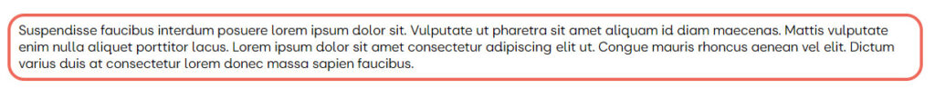
- Highlighting a complete paragraph, using the style options in the right-hand pane, and to further emphasise a paragraph, a colored border can be added as shown below. Depending on how the paragraph is placed (e.g. inside or outside a group or column), a coloured drop shadow can be added.
The following has a group block containing a paragraph, with a red margin, with a width of 4 px and a corner radius of 20 px
This can be achieved as follows, using the breadcrumb trail in the lower left of the screen to ensure the correct block is selected.:
- Enter the required text into a paragraph block
- Select the paragraph mark (¶) in the block toolbar, then select group. This places the paragraph into a group block.
- With the group selected, use the Styles sidebar, and then the Border option to define the width and colour for the border – this is found in the Dimensions options at the bottom of the style pane.
- If required, the corners can be curved as shown.
- To optimise the display, the paragraph margins may need to be adjusted. The “Inner block to use content width” should be deselected in the group settings pane to optimise the display.
If required, the background can be either a colour or an image as shown below. However, the content provider MUST ensure that the block conforms to the TAT and WCAG accessibility requirements.

A border can also be added by placing the paragraph into a column block, where a drop shadow can be added, if required.
Quotations and Verse #
Three options are available to add quotations to pages: Quote, Verse or Pullquote. In all cases, the available options in the Toolbar are identical to those in a Paragraph. Background images can be added to all three blocks, using the Background Image option in the block’s right-hand sidebar.
Authors and Content Creators should be aware of copyright and good practice when using a quote from an external source. If a quote is used, the context must be provided and should be correctly attributed.
Quote #
The Quote Block will provide the following layout:
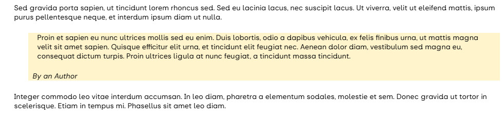
In the above example of formatting using the Quote Block, the background colour has been applied to differentiate the Quote Block from the paragraph blocks above and below. In addition, an image can be used as a background.
The Quote Block allows a citation to be added (in this case, “By an Author”)
Pullquote #
If the Pullquote Block is used, the text will appear as shown below. Again, there is an option to add an author or citation.
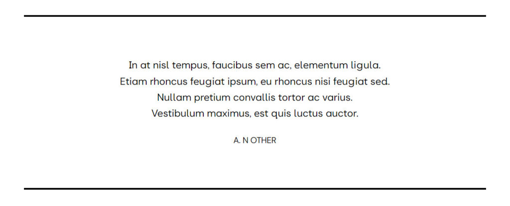
Verse #
If you want to format text in a verse format, the content creator can use the Verse Block. In the example below, the text indentations and line returns have been respected; finally, the text has been centred:

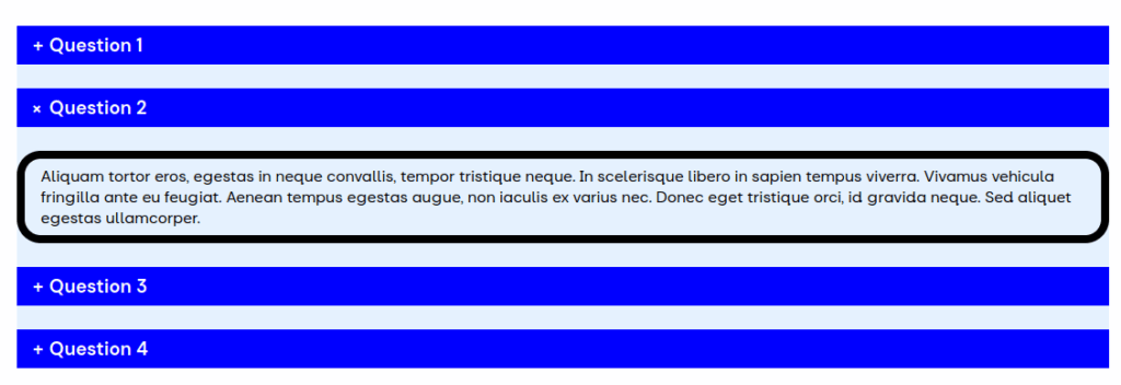
List #
Constructing a list #
Using the Block Inserter, select List. This will place a bullet list on the page at the defined location. After entering a list item and pressing return, the list entry will move to the next item. In WordPress, a row is considered the child of the parent list. The List Block Toolbar gives the following options: from left to right,
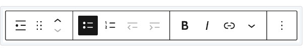
- Change block type.
- Drag the block.
- Move the block up or down.
- Unordered list.
- Ordered list.
- Outdent
- Indent.
- Selected text to Bold
- Selected text to italics
- Add a hyperlink.
- Additional formatting options include highlights, inline code and in-line images.
- More options, including deletion of the list item.
When a row is selected, the options allow it to be indented or outdented from its current level.
The two types of lists available are shown below, the ordered (left) and unordered (right):
- Acinia nec
- Morbi luctus
- ipsum in iaculis
- Venenatis
- Nulla quam facilisis
- Vitae laoreet
- Venenatis
- Cras a eros pulvinar,
- interdum ex et
- Maecenas auctor
- Cras bibendum mattis lacus,
- quis elementum
- Quisque malesuada
- Acinia nec
- Morbi luctus
- ipsum in iaculis
- Venenatis
- Nulla quam facilisis
- Vitae laoreet
- Venenatis
- Cras a eros pulvinar,
- interdum ex et
- Maecenas auctor
- Cras bibendum mattis lacus,
- quis elementum
- Quisque malesuada
- It is possible to adjust both the start value of the numbered list and reverse the increment direction.
- The ordered list can use numbers, upper and lower case letters, and upper and lower case Roman numerals.
- If you require a blank line in a list, use Shift+Enter at the end of the preceding line.
Formatting a List #
Tools to format a list are found in the right-hand sidebar:
When the list block is selected, the following options are available from left to right:
- List View: provides a view of the list, and the editor can select or add individual list items.
- Settings: Allows the addition of an anchor or CSS code
- Style: All the colour and typographic style of the complete list to be modified, together with the addition of borders, padding and margins.
List Formatting Considerations #
When a list is entered into SiteWorks, the content creator will note that the text of the list aligns with the edge of the block or document, with the dots or numbers effectively in the margin, e.g.
- Line 1
- Line 2
This will look ugly and can be considered to be poorly formatted. The solution is to add padding, from the List block dimension option (in Style), with the padding value set to Large, the list will appear as:
- Line 1
- Line2
By adjusting the padding, the position of the indented items relative to the main list can be modified. Adjusting the values makes for a far more readable list.
Adding and Populating a Table #
A table should not be used as a structural element; other blocks, such as the text and media block or columns, should be used instead. Tables should only be used to represent a set of data.
Setting up a table #
To add a table, from the block browser, select Table, then enter the required number of rows and columns, and select Create Table.
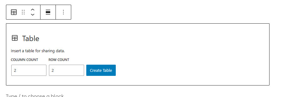
Once created, the table can be populated and modified as required
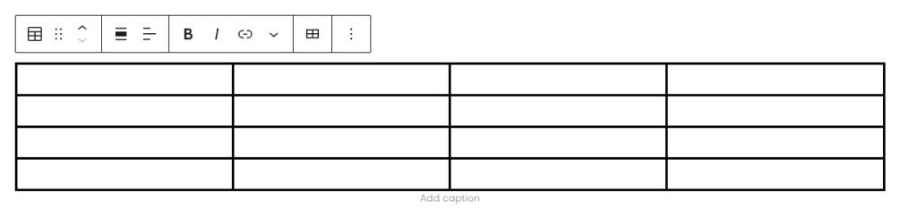
The Toolbar options from left to right are:
- Change block type.
- Move the block up or down.
- Align the table in the page, none, left, centre or right.
- Align text with a column.
- Selected text to bold.
- Selected text to italics.
- Selected text as a hyperlink.
- Additional formatting options include highlight, inline code, inline image, keyboard input, and other formatting options.
- Adding and deleting rows and columns.
- Additional options include removing the table.
The Table Settings sidebar contains options for the table’s header and footer rows. The cell width can be either fixed or variable. In variable cell width, the width is dependent on the text entered into the cells.
The Table Style sidebar allows a range of options to be selected:
- Default
- Colour of the text and background.
- Size of the type.
- Border, padding and margin dimensions.
- Stripes: provides structured content by colouring alternate rows.
- Colour of the text and alternate background.
- Border, padding and margin dimensions.
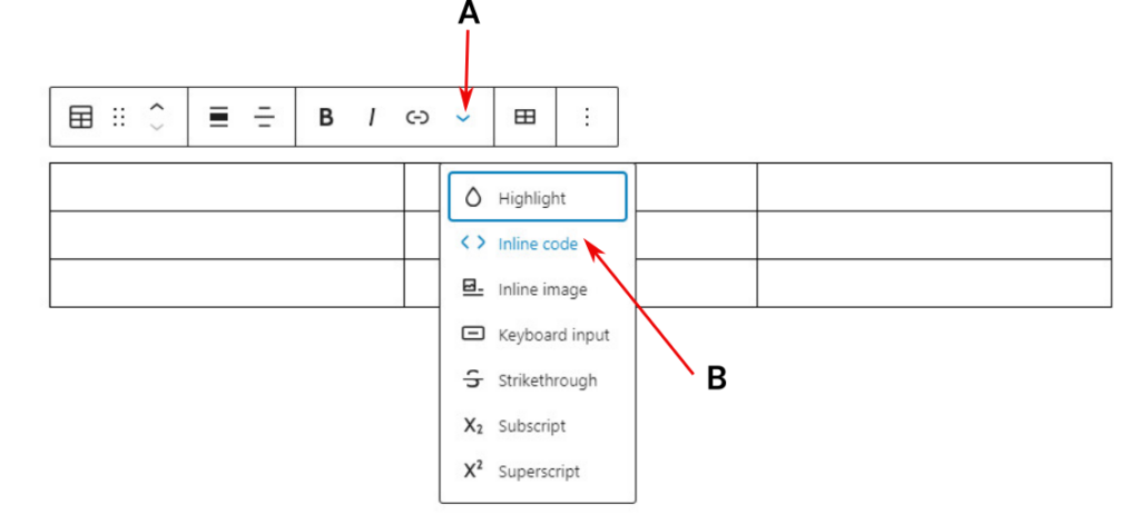
Adding an Image to a Table #
An image can be added to a table cell (only if it is relevant tabulated data), as follows:
- Select the cell
- From the Toolbar, select More using the inverted caret symbol, A.
- Select Inline image, from the menu (B), which directly takes the content creator to the Media Library to select the image.
- The image size is set to a default width of 150 px (i.e. a thumbnail), and the aspect ratio is unchanged. If the image is selected, its width can be adjusted. The content creator needs to be aware of maintaining a constant aspect ratio across multiple images, or the display could look ragged.
To delete the image, select the image, then Del.. Take care not to delete the table by referring to the Breadcrumbs in the bottom left of the screen.
Accordion Block #
The Accordion block is typically used to hold FAQs or similar content and has considerable similarities with the Detail block, but with additional styling features. The current implementation is a bare-bones approach that allows content providers to add styling as required, either manually or through the use of CSS as discussed here.
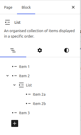
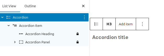
The Accordion block is not a single block. There are actually four within a nested structure, which can be seen in the List document view.
- Accordion: Primary container block for nested Accordion Items.
- Accordion Item: Direct child of the Accordion block that contains Accordion Heading and Accordion Panel blocks.
- Accordion Heading: A heading element for opening/closing the Accordion Panel.
- Accordion Panel: A container block where you can insert custom blocks, such as Paragraph, Image, and more.
Constructing an Accordion #
On the required page, add the accordion block. This provides the primary container and a single accordion item. To add additional accordion items:
- Select Accordion in the List View.
- Use Add Item to provide the required number of items.
- Do not add another Accordion block
Populating and formatting the accordion #
Once the structure has been defined, the text for the Accordion Heading and the Accordion Panel can be added. The accordion panel can contain any block as required. Once the information has been added, the accordion can be formatted. If the CSS route is not taken, each element needs to be formatted individually. Once formatted, the following display can be obtained:
The formatting was:
- The Accordion background was set to very light blue, and the control icon (+) was set to show and positioned to the right.
- The Accordion Header is white text on a blue background.
- The paragraph in the Accordion Panel has a transparent background with a black border.
Detail Block #
The Detail block allows a user to select, for example, a query, which reveals further information, and is simpler than the Accordion Block, as each entry is an independent block. From the Block Inserter, select Details, and enter:
- The required “title” replaces the Write summary text
- The hidden material is added, which can include images, tables, etc.
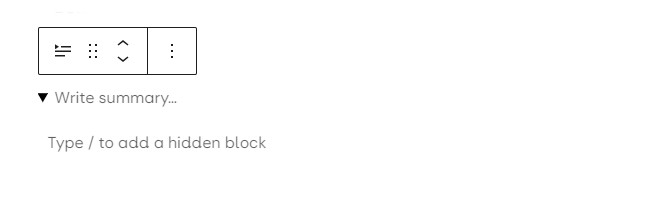
When displayed, only the summary text is visible. If the text or arrowhead is selected, the hidden text appears; in this case, Detail 3’s information is contained in a text and media block.
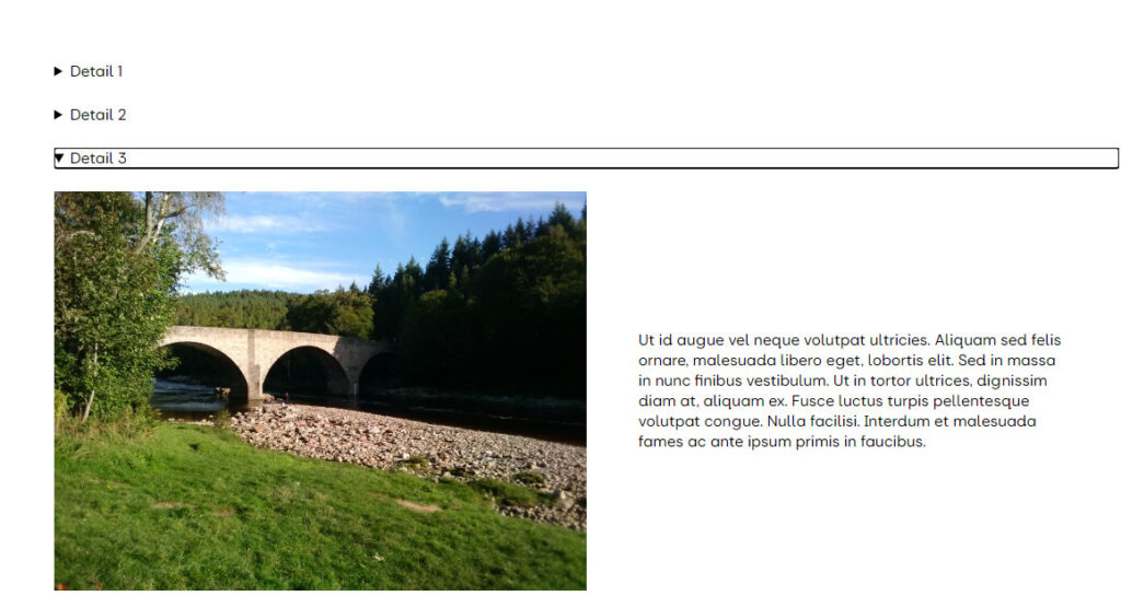
As each Detail block is independent, each must be entered and formatted separately.
In the above example, three columns of equal size are being edited, where:
- Column one contains an image above a Paragraph block.
- Column two contains a Paragraph block.
- Column three is currently being edited, and on selecting +, the block browser opens. The block Toolbar allows the editor to select the column block, interchange columns or align the contents of an individual column.
The options for a column include:
- Settings:
- If blocks are nested with a column, the content width of the nested blocks can be controlled.
- Adjust the width and justification.
- Style
- Text and background colour
- Padding and margin adjustment
- Addition of a block border
The Column (i.e., child) Block Toolbar can be accessed from the Columns (I.e., parent) block toolbar as required.
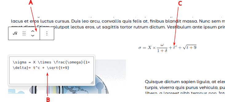
Maths Equation Editor #
A specialist maths equation editor is provided; however, knowledge of LaTeX formatting is required. To enter an equation, select the Math block from the Block Inserter.
Symbols #
While editing a page or post, there may be a requirement to add a specific symbol, for example, the copyright symbol, ©. Symbols such as this have to be entered as HTML. Content creators can use one of two approaches:
Edit as HTML #
From the block option menu, select Edit as HTML, enter the required code at the correct location, and return to normal editing by selecting Edit visually. The symbol will be shown in the text. Care should be taken to ensure the existing HTML is not changed. or significant re-editing may be required.
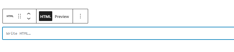
Custom HTML block #
To insert a symbol or other HTML, a Custom HTML block is provided in WordPress. To use, select the block and enter the required code, either as the HTML Entity (if it exists) or the HTML code in the Write HTML box. Two display options are available: either an HTML code view or the Preview that displays the resultant symbol or changes due to the code modification.
HTML Symbol Codes #
A selection of symbols is given below; however, many more, including dingbats and Emojis, are listed here.
| Name | Symbol | HTML | HTML Entity | Name | Symbol | HTML | HTML Entity |
|---|---|---|---|---|---|---|---|
| Copyright Symbol | © | © | © | Degree Celsius | ℃ | ℃ | |
| Euro | € | € | € | Ballot box with check | ☑ | ☑ | |
| Tick or Check | ✓ | ✓ | Telephone | ☎ | ☎ | ||
| Dagger | † | † | † | Double Dagger | ‡ | ‡ | ‡ |
| Division | ÷ | ÷ | ÷ | Multiplication | × | û | × |
| Spades | ♠ | ♠ | ♠ | Hearts | ♥ | ♥ | ♥ |
| Clubs | ♣ | ♣ | ♣ | Diamonds | ♦ | ♦ | ♦ |


