Introduction #
WordPress has several features that allow content creators to maximise the impact of their work. This guide contains details of the following features:
Columns #
WordPress allows the use of columns, allowing pages to be laid out in multiple columns, as is commonly found in newspapers. However, care must be taken to ensure readability is maintained. The use of columns is recommended if you are laying out a page in a “tabular style”
From the block editor, select Columns, and from the options select a predefined one, two or three-column layout. If more than three columns are required, an additional plugin will be required.
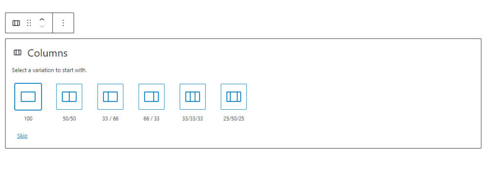
If the 33/33/33 option is selected, the result is:
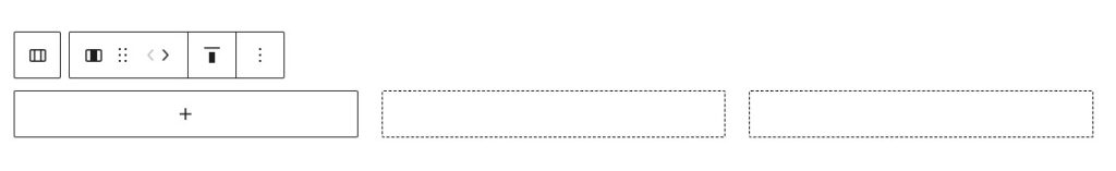
The Column toolbox gives the following options from left to right:
- Select the parent Columns block.
- Move the column
- Align the columns
- Other options
It should be noted that it is possible to stack columns on a mobile device, using the option in the Settings Toolbar
The size of individual columns can be adjusted by selecting the required column and adjusting the width in the Settings option, in the right-hand sidebar. While several units are provided, it is recommended that % is used, this ensure that the sum of all the columns does not exceed 100%.
Once the basic column layout is selected, text and images can be entered into each column by using the block editor. In the editing view, an empty column is highlighted as a dotted box, as shown above.
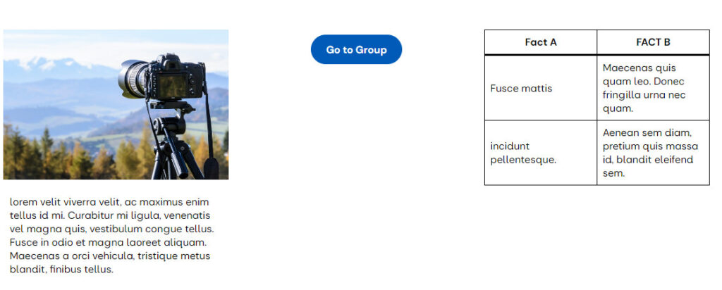
In the above example, three columns of equal size are shown, where:
- Column one contains an image above a Paragraph block.
- Column two contains a button linking to a group page
- Column three, a two × two table
The options that can be applied to a column include:
- Settings:
- If blocks are nested with a column, the content width of the nested blocks can be controlled.
- Adjust the width and justification.
- Style
- Text and background colour
- Padding and margin adjustment
- Addition of a block border
The Column (i.e., child) Block Toolbar can be accessed from the Columns (I.e., parent) block toolbar as required.
Spacer #
The Spacer block allows authors to place a white block into the text to aid the reader. In the editing view example below, a spacer (100px in depth) is being added between two paragraphs. White space should not be considered wasted space, but an important addition to readability.
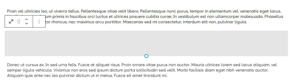
The Spacer block’s height can be controlled by using the settings sidebar.
Grid layout #
The Grid Layout allows the content provider to arrange blocks in a grid, similar to the Group, Row and Stack blocks. On selecting the Grid Block, the basic grid is made available:
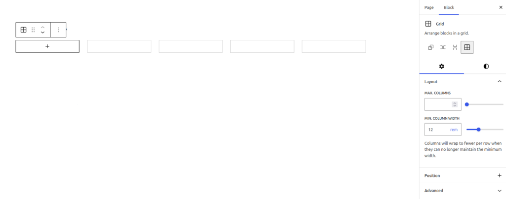
In the Settings pane, the content provider has the option of:
- The number of columns across the screen is defined. In the above example, the five columns will be displayed irrespective of screen width. It should be noted that a large number of columns may lead to accessibility issues when the page visitor uses a mobile phone.
- The minimum column width in rem, this ensures that your text and layouts scale across different devices, improving accessibility.
- The Advanced settings allow the setting of an HTML Anchor.
The Style pane provides options for text and background colours, adding a background image, setting the margins, padding and block spacing, and, if required, minimum row height.
To enter content, select the content block using the block inserter icon in the left-hand column, and enter the required block and content. To enter the next column, ensure that the grid is selected, using the breadcrumbs, select the block inserter icon and then insert the block required, followed by its content. Continue the process until the grid is complete. The addition of further rows is handled automatically.
In the case of the Paragraph block, there is an option that allows the block to extend over one or more columns or rows. This is found in the Paragraph settings under Column and Row Span.
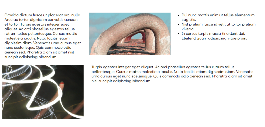
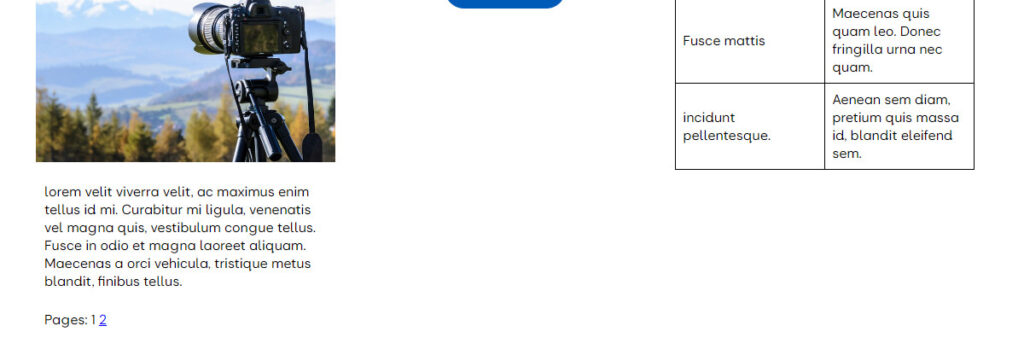
The following grid consists of a paragraph, an image and a list in the first row, then an image and a paragraph spanning two columns in the second row:
Once the grid has been populated, it can be formatted to give the following:
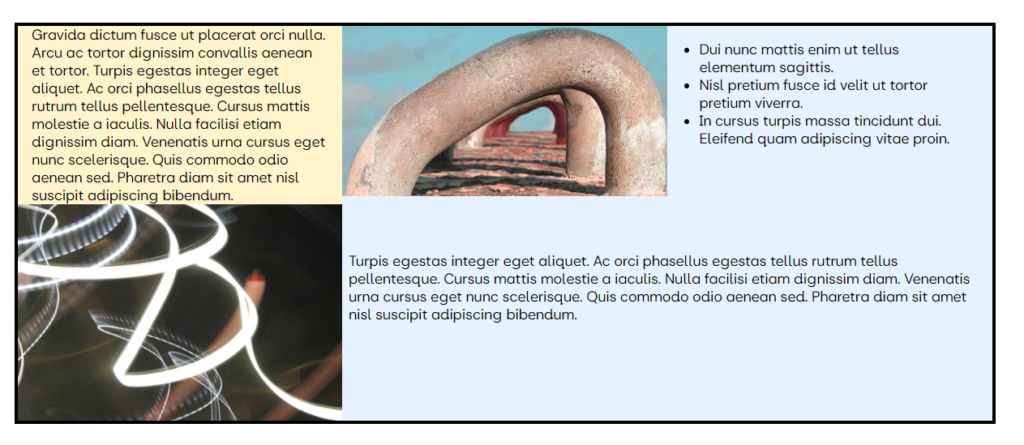
Given the possible formatting options available in individual blocks and the grids, a considerable number of display options exist. In this case, the following formatting has been applied:
- Grid:
- Auto type, with 300px width.
- Block spacing set to zero, in style
- Very Light Blue background.
- 4 px black border added
- Top left paragraph.
- Very Light Yellow Background
- No padding: top and bottom.
- “Small” padding left and right.
- Top Middle Image
- Standard Image Block
- Top Right List
- “Small” padding: top and bottom.
- “Large” padding: left and right. If this is not applied, the list’s dot will appear outside the grid boundaries.
- No background colour was selected (i.e. left transparent to see the grid background colour)
- Bottom Left Image.
- Standard Image Block used
- Bottom Right Paragraph.
- Column span set to 2, row span set to 1. These settings are found in the paragraph’s block settings pane on the right-hand side.
- “2 X” padding on the top and bottom.
- No padding was added on the left or right.
- No background colour was selected.
Separator #
The Separator block allows a fixed-width line to be placed between blocks; the line can either be short or wide and in any colour from the u3a palette. A separator can be used to separate ideas within a piece of text to improve readability. By selecting Dimensions in the style sidebar, the wide space above and below the line can be adjusted either linked or separately, as shown below. Three separator options are available:
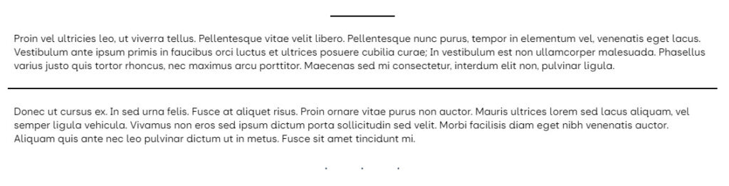
Page Break #
In a limited number of cases, a page may become excessively long, for example, a report of a meeting or a visit report, and for ease of viewing, the content creator may wish to split it into two or more pages. While several separate WordPress pages could be authored and linked together, a more convenient approach, for both the visitor and content creator, is to use the Page Break block. This block effectively splits the single page into multiple subpages for the visitor. If the page break is inserted, the following is displayed:
In the above example, by selecting 2, the visitor is taken to the second part of the page. In addition, the visitor can toggle between the “sub-pages” with ease
Breadcrumb Block #

This section refers to the Breadcrumb Block and not the Breadcrumb feature in the WordPress editor, which is discussed here.
As a website becomes more complex in scope, it is considered best practice to add a page breadcrumb, so that (a) the visitor knows where they are in the site and (b) provides a quick route for the visitor to return to the home or other significant page. The block can be added in the usual manner at the bottom of a page.
The current implementation has several limitations within SiteWorks:
- If the block is placed on a Group or Event page, the breadcrumb resolves as: Home > Group or Event category > the Group or Event Page
- The Breadcrumb on a single page always directs the visitor back to the Home Page and not intermediate pages.
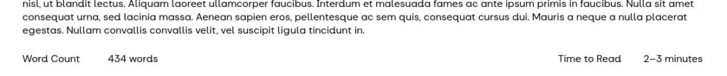
Time to Read and Work Count #
Two additional blocks can be added to a page for information:
- A Time to Read block can be added to indicate an estimate of how long a page takes to read to the content creator and visitor, based on 200 words per minute.
- A Word Count block can be added