
Photographs should be uploaded as JPG or JPEG files, as these will be significantly smaller in size than the corresponding PNG file. This will lead to faster uploading to a browser and a reduction in server storage requirements. When the image is a diagram or logo, a PNG file may be preferred, as this will maintain definition and, if required, background transparency.
Introduction #
This user guide discusses adding an image to a WordPress document. For clarity, the term image is used for any media in JPG, JPEG, PNG, GIF or ICO formats; in general, these will be a photograph, drawing, graphic, or icon.
Before using this guide, it is assumed that you are familiar with (i) the concept of block editing, (ii) uploading media to the Media Library, (iii) copyright, and (iv) accessibility issues.
When an image is used on a u3a website, the content creator and/or the web manager must ensure that either the image has a licence allowing you to use the image or you have the copyright holder’s permission to use the image.
Images can be inserted into a page or post using one of several blocks, including:
An additional plugin, Lightbox, is required to display a specific image when selected, when a Gallery and Gutenslider is used.
Images can also be placed into tables, as discussed here. However, it should be noted that tables should not be used as a formatting tool.
Icons are small images or symbols used to represent a specific tool, file, or command (e.g., a magnifying glass for “Search,” a floppy disk for “Save,” or a social media link). WordPress provides an extensive library for the content creator, allowing an Icon to be easily added via the block editor as discussed here.
Captions #
All WordPress image blocks allow the addition of a caption, except for the Media and Text, Cover Block and the Gutenslider. The Cover Block displays an image that the content creator can add text and other content over the top. In the Gallery block, the captions are overlayed in the Gallery view, but not shown when the individual image is selected in Lightbox.
Where a caption can be added, it should provide details that will allow the viewer to comprehend the purpose of the image. It should be noted that the available space for captions in WordPress is somewhat restricted compared to other forms of media. In addition, when using images associated with a licence, this must be shown as part of the caption.
It should be noted that:
- The image caption appears as an overlay to the image. The caption can be entered when the image is uploaded to the media library or when the image is used.
- Changing the image’s caption on a page does not replace the caption attached to the image in the media library.’
- Some Image Editors automatically enter text into the caption block, e.g. GIMP can enter “binary comment” or “Developed using darktable 3.X.X”- hence all captions and Alternative Text content should be reviewed carefully.
Image Block #
Uploading the image #
To insert an image into the page, the Image block should be selected from the Block Inserter, then select the image source:
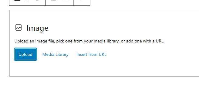
- Upload allows you to directly select an image present in one of your computer’s directories.
- Media Library takes the user to the Media Library to select an image that has been previously uploaded.
- Insert from URL uses the URL of the image. When you have selected the image from the internet, right-click to select the URL. This should be entered into the box. If this route is used, the option to upload the image file directly to the media library is not available. This approach is always recommended, as external website URLs can change over time.
Once uploaded, the content creator can add or modify the Alternative Text. It is important to note that if the Alternative Text has been added to the Media Library image, it will be copied across with the image. However, any changes to an image’s Alternative Text within a page are NOT copied back to the image in the Media Library.
After uploading, the image appears on the page, with its associated Toolbar as shown:
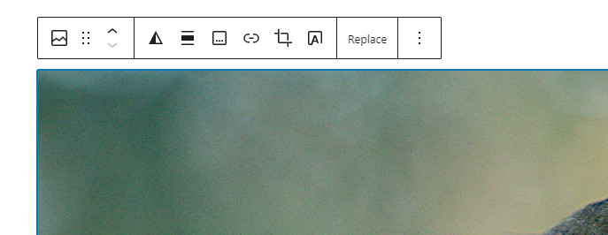
As shown, the following options are available from left to right:
- Ability to transform to other block types, including Media and Text, Gallery or Cover.
- Drag the block to another location on the page.
- Move the block up or down one block relative to its current position.
- Apply a Duotone colour filter. The duotone effect is equivalent to a black-and-white filter, but instead of the shadows being black and the highlights being white, the content creator can select a colour for the shadows and highlights.
- Align the image, i.e. left, centre or right.
- Add a caption to the image
- Add a link to the image, allowing the following options:
- Link to image file: The original image can be viewed at full-screen resolution.
- Link to attachment page: Provides the image’s title and description field.
- Expand on click: When this link option is selected and visitors hover over images, their mouse pointer will change into a magnifying glass. Clicking on the image will open an enlarged version in the lightbox.
- Crop the image, typically to a standard aspect ratio.
- Apply text over the image, note this effectively converts the image to a Cover block.
- Replace the image. After selecting, a box appears with the option of opening the media library or directly uploading an image.
- A further set of options, including deleting the complete block
Once uploaded to the page, the image can be aligned, with reference to the page, as follows:
- Not aligned – the default option.
- Align Left
- Centre
- Align Right
Selecting Align Left or Align Right results in text from the paragraphs following the image (in this case, the image is sized 211×259 pixels) to wrap around the image as shown:
Display options for an image #
A range of options is available from the sidebar::
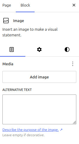
The content pane allows the content creator to:
- The media box displays the name of the image file, and if selected, provides options for replacement.
- Add or modify the Alternative Text to conform to the page context..
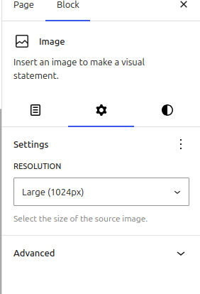
The settings options allow the content creator to:
- Modify the resolution of the image, noting that the image quality will be degraded if the image resolution is set lower than that required by the image size.
- Using the advanced options to
- Adding an anchor
- Add additional CSS
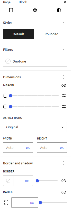
The style options allow the content creator to:
- Set the basic shape of the image, either as uploaded (default) or converted to an image with rounded corners.
- Apply a two-tone filter (duotone).
- Apply a margin to the image
- Change the aspect ratio as required to optimise page layout. If the original aspect ratio is deselected, two options are available:
- The actual picture size in pixels can be selected.
- Add a border, rounded corners or a dropped shadow to the image
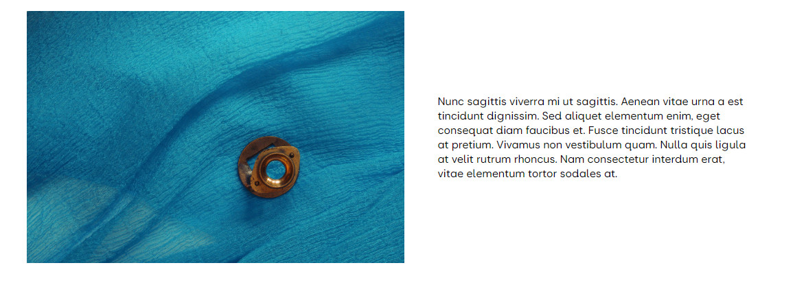
Media and text block #
The Media and Text block allows text to be displayed alongside an image. This block does not have a border or a rounded corner option. If this is required, the block needs to be embedded in a group or columns block, as discussed here.
After selection, the block gives the content creator two areas, one for the image and one for the text, or other blocks:
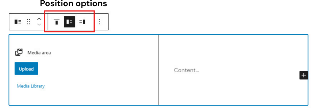
In the above example, the image can be inserted in the left-hand section and text in the right-hand section. The text can be positioned to the right, left, or above the image using position options. Text is entered using +, and can include multiple blocks of paragraphs, lists, tables or quotes.
Available options are included on the block Toolbar:
- Stacking the image and text on a mobile device, as opposed to a side-by-side presentation when a monitor or tablet is used to view the page.
- The image can be cropped to fill the column; this may require adjusting the image position by using the Focal Point Picker.
- The width of the media column.
It should be noted that an image caption cannot be added to this block. Any copyright or similar information should be added to the supporting text or within the metadata as required. This is a known WordPress issue,
Adding an Icon #
Using the Icon Block #
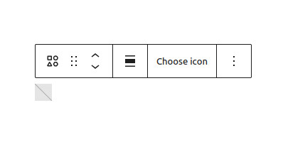
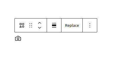
WordPress has a library of over 80 icons, typically those used on websites, that can be added to a page or post. To select an icon, select the Icon block from the Block Inserter, then Choose icon, to access the icon library page (A) that shows the available icons. The content creator then selects the required icon. Once the icon has been inserted, reselecting the icon allows the icon to be replaced or deleted ( B)
The settings sidebar allows a label and/or anchor to be added. It is recommended that a label be added to help screen reader users. The icon’s width, colour and background can be selected or modified from the styles sidebar.
Social Media Icons #
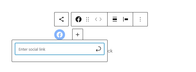
To encourage visitors to view other media channels, from your u3a e.g. Facebook or Instagram, a social media icon can be provided, using the Social Media block.
- Place the Block Inserter at the required location, and select Social Icons.
- Click on Plus again to add the required icon; using Browse All may be required to find the correct icon.
- Select the Icon to add the required address. If an address is not entered, the icon will not appear.
Selecting the Social Icon block, the content creator can see the following in the right-hand sidebar.:
- List View: provides a list of all social media icons added
- Settings options
- Justification
- Vertical or horizontal Orientation
- Open the link on a new page
- Show text
- Styles Options
- Default or Pill will add a border as opposed to only the logo
- Icon colour and background colour
- Spacing
The example below has the following options selected: Centre Justification: Vertical Orientation: Show text: Pill Shape: Icon colour and background deselected

The example to the left has the following options selected:
- Centre Justification
- Vertical Orientation
- Show text: Pill Shape
- Icon colour and background deselected (i.e. default colours are shown)
It should be noted that the Social icons block and the individual social media icons are treated as separate blocks within WordPress; care should be taken during configuration.
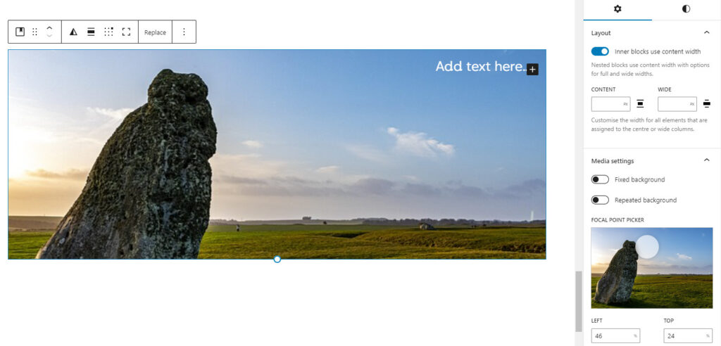
Cover Block #
The Cover Block allows text to overlay an image, which could be particularly useful for home page images or headers for groups and events. An alternative to the Cover Block is text with negative margins; this has significant advantages in certain applications. In both cases, the text will be recognised by a screen reader.
Select Cover, the block has two main background options: an image or a solid colour from the u3a palette. Text can be added as required.
Options are available, left to right, in the Toolbar.
- Transform to a different block, including Image and Media and Tex blocks..
- Drag the block to another location on the page.
- Move the block up or down one block relative to its current position.
- Apply a Duotone colour filter.
- Align the block, i.e. left, centre or right.
- Position the contents within the image to one of nine options; in the above case, the top right has been selected.
- Toggle the image from cropped to full size.
- Replace the image.
- Further options include deleting the block
The settings box contains the option to modify the size of the inner blocks to optimise the display. In addition, when a cropped image is used, a focal point “picker” is provided to adjust the image relative to the caption.
It is important to note that within the style sidebar, an overlay opacity setting is provided; at 0% the image is as uploaded, while at 100% only the overlay is visible. In addition, options are provided for the text colour and the size of the padding and margins.
Gallery Block #
The Gallery block displays multiple images in a single block. To create a gallery, insert the Gallery Block at the required location.
The media option pop-up is then displayed, with the option of uploading images from your computer or selecting from the Media Library.
If the Media Library is used, select the images, and the selected images will display a tick. At this stage, a caption and alternative text should be added. Once the selection and annotations are complete, select Create a New Gallery to confirm the selection and then on the next screen, Insert Gallery.
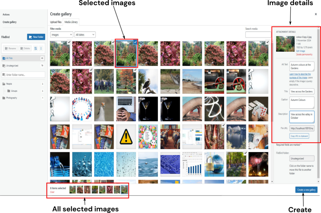
The Gallery of selected images will be added to the page. Once placed, each image may be edited, using the breadcrumbs to swap between the image and the gallery. Captions, descriptions, and alternative text (Alt Text) may be added to each image as required.
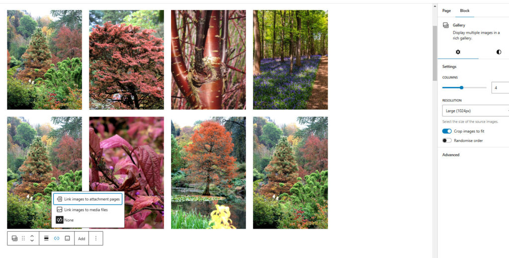
As with images, the right-hand side bar gives several options:
- Media pane
- Provides a list of all the images in the gallery, and allows the addition of alternative text and image replacement when a particular image’s details are selected.
- Settings pane
- The COLUMNS slider is set to the required value (4 in this case)
- Image Resolution. It is recommended that the highest possible is used to maximise the image’s quality.
- The Crop images to fit option. When selected, the display is far neater and independent of the actual image size.
- Randomise the display order.
- Adjust the Aspect ratio of the image, allowing the best presentational fit to be achieved.
- Advanced settings, including the provision of an anchor.
- Style pane
- Ability to set the background colour.
- Block spacing
- The provision of a border and, if required, its radius.
The resultant gallery is shown below and is configured as a four-by-two grid, with cropped images.
The gallery toolbar provides the following options, from left to right:
- Change the gallery to another block, including Image, Columns, Gutenslider, and Group.
- Drag the complete block.
- Move the block up and down the document.
- Align left, right, or centre.
- Add link options:
- Link to the image’s attachment page to show the title and description.
- Link the image to the media files.
- Enlarge on click, with a lightbox effect.
- No links required
- Add or remove the Gallery caption.
- Add more images to the gallery
- Further options include deleting the complete gallery.
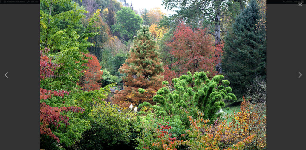
If the Link the image to the media files option is selected, when the gallery is being viewed, a “hand” icon will appear over the image. When selected, the full image is shown. The visitor can move through the complete gallery using the arrows. In a Gallery, the image’s caption is overlaid on the image, and not displayed when the image is selected and displayed in Lightbox.
Gutenslider #
The Gutenslider is a powerful third-party block that provides a media slider capability to a u3a’s website. In principle, the Gutenslider presents a sequence of slides (a Gutenslide) that can be either an image, text, or a combination of both, thereby enhancing the visitor experience.
It is important to note that some option settings are only available in the PRO version. Currently, it is not recommended that this version be purchased. The unavailable options in the version distributed with SiteWorks are identified by †.
Developing a Basic Image-Only Slider #
To add the slider to a page or post, select the Gutenslider Block from the media section of the Block Inserter. The content creator is then presented with two options:
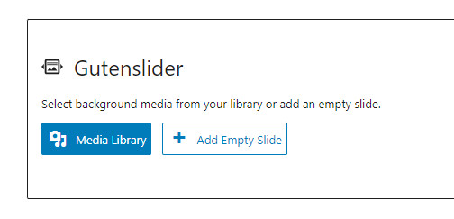
To show only images, select the Media Library and then the images– this is done identically to a Gallery. Select Create a new gallery upon completion of the selection. This will take the content creator to the Edit gallery page, which allows the addition of a caption and the ability to modify the display order. Once editing is complete, select Insert gallery to load the selected images to the Gutenslider.
The Add Empty Slide option is used to add an individual slide that may contain text on a plain background, as discussed here.
Selecting Gutenslider Options #
Once the gallery has been inserted into the slider, Gutenslider has a large number of options to configure how the slider operates. For full details, reference to the plugin documentation is advisable; however, for the majority of u3a applications, the following options will allow the display to be optimised:
- Animation: sets the transition between individual slides, the options are (i) slide: the new Gutenslide slides in from the side, (ii) fade: the new slide fades in as the old slide fades out, and (iii) flip: the old slide rotates to reveal the new slide.
- Slide Mode: Since text can be added on top of the images, this option determines whether one piece of text appears over all the images (fixed) or if the text content is different for each image (changing). This is discussed further here.
- Slider Height: The height of the displayed images can be set as either:
- Fixed option: all images are cropped to a set size, giving a more consistent display. The size is set by Minimum Slider Height, which sets the minimum height of the slide as a percentage of the screen or in pixels. In this mode, the Focal Point of an individual Gutenslide may need to be adjusted.
- Adaptively, the display size changes as the image size changes, which can lead to a very poor progression and user experience.
- Slides to Show: The option takes the images’ natural dimensions into account. No Cropping and no page jumping will occur. The fixed slider height and the width of the images will be set automatically.
- A group of five display options can be configured as required. If selected, further configuration is available below the selection buttons for those with an asterisk. The options are:
- Autoplay*
- Arrows*
- Show Dots* (options in Progress)
- Keyboard navigation†.
- Loop.
- Fullscreen Background Slider – this provides a slider that fills the whole screen, but is incompatible with the SiteWorks theme.
- Autoplay: A pause on hover option is selectable.
- Arrows. Allow the selection of the forward/reverse arrow design size and colour
- Progress. Allows the configuration of the progress dots, their location, size and colour can be adjusted.
- Lightgallery. Enables the Lightgallery option, which allows the display of the full image when selected. In addition, the option to display thumbnails below the image when in the Lightbox display is available.
- Dividers. Allows a coloured divider to be placed at the image’s top and/or bottom.
- Spacing. Adjust the spacing around the image
- Advanced. Allows the content creator to disable the slider function on desktops, tablets or mobiles as required.
Gutenslide Options, including Adjustment of the Focal Point #
To access an individual slide, open the list view using (A) and then the required slide (B) under Gutenslider, which provides several options in the right-hand sidebar:
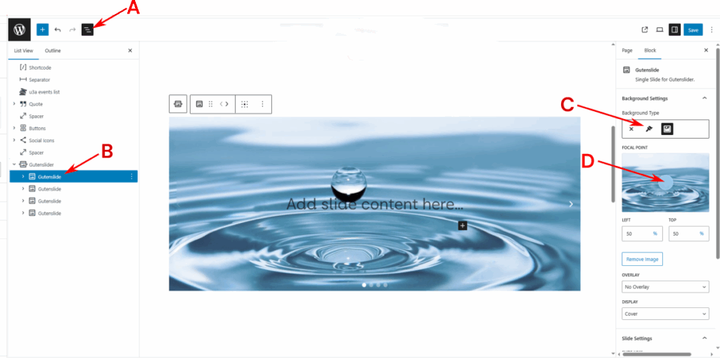
- Background. The background to the slide can be set (C) to none, a single colour or an image.
- Focal Point. Adjust the focal point. If the Gutenslider height is fixed, the system will crop the image; hence, a key part of the image may be incorrectly placed when the Gutenslide is displayed. This can be resolved by adjusting the Focal Point, as follows: select the circle (D) with a pointing device and move until the view is considered correct.
- Overlay. A colour overlay or colour gradient† can be added, the transparency of which can be adjusted.
- Display. The display option should be kept at None.
- Hide Slide. The slide can be hidden in the final display, but remains in the slide stack.
- URL. A URL can be added to the slide, linking it to either an internal or external resource. If a URL is added, the image cannot be individually selected for display in Lightbox.
- Automated Captions†
Editing a Slideshow #
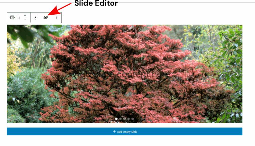
To edit the slideshow, select the Gutenslider and from its toolbar, the slide editor, as shown, giving access to the media gallery.
Once the Media Library is open, select the required action from the left-hand side:
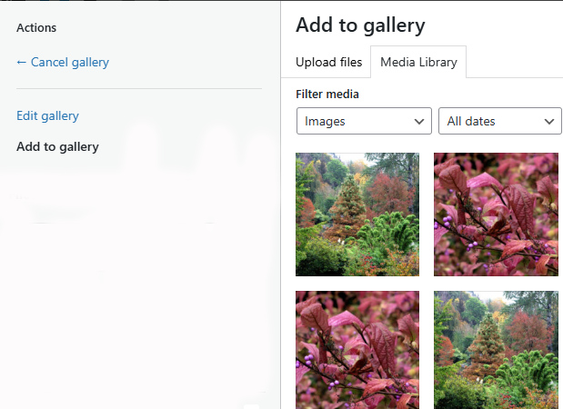
The available actions are:
- Cancel: Returns the slider to the original display.
- Edit:
- The order of the slides can be changed by dragging the image thumbnails.
- An image can be deleted by selecting the cross in the image thumbnail.
- To confirm, select Update gallery in the bottom right of the screen.
- Add to Gallery
- Select additional images from the Media Library as required.
- To confirm:
- Select Add to gallery from the bottom right of the screen to show all the images in the slideshow as thumbnails.
- To confirm, select Update gallery in the bottom right of the screen.
Images with overlayed text. #
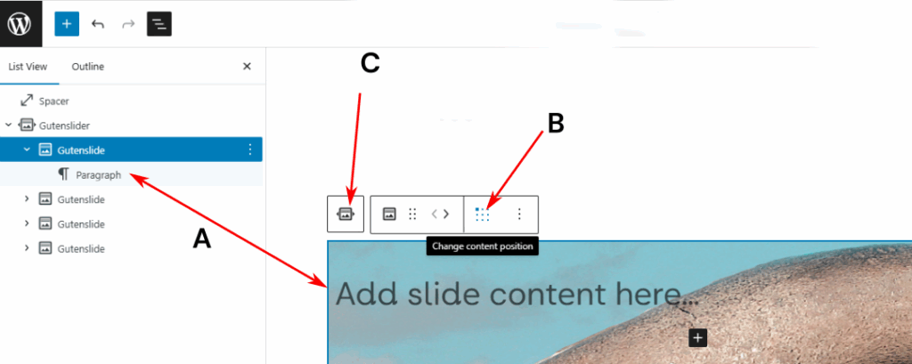
Text can be added on top of an image, as a paragraph block, by replacing the Add slide content here text. Note that the Add slide content here text appears only when Changing is specified in the Slide Mode option, and is a paragraph, visible in the List option (A). The location of the text can be changed by using the Change content position option B. Care must be taken with the text’s colour to ensure it is visible over the image. It should be noted that when the Lightbox is selected, the overlayed caption will not appear in the display.
If the list view is opened, the text paragraph is shown. In the Gutenslide toolbar, option C, will take the content creator to the parent Gutenslider block.
Text-based Gutenslides #
Gutenslider can generate a slideshow for instructions or other information as required. To develop a presentation:
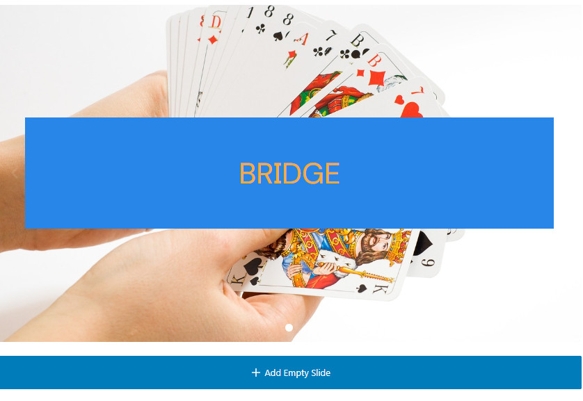
- Select Add Empty Slide, which allows the background to be selected; the options are none, a colour, or an image. In the example below:
- The slide background is the image of a hand of cards.
- The paragraph has a background of u3a Light Blue and a text colour of u3a Orange. The text has been added by replacing Add slide content here, with the padding suitably adjusted
- The + Add Empty Slide allows the content creator to extend the slideshow as required.
It is recommended that if this approach is used to present information, the Autoplay option is deselected, so that page visitors have time to read the text – typically, the display time set in Gutenslider will only allow ten words or so to be read and understood. However, explanatory text will be required to inform the page visitor on how to move through the slides.


